Supporting Multiple Screen Resolutions in Your NativeScript App
The explosive growth in mobile devices over the last decade has made device fragmentation even worse. Although it benefits the end user, device fragmentation can be hell for the developer. For your app to gain maximum exposure it has to run on as many devices as possible. But while the business logic stays the same the UI often has to be tweaked to support the available screen sizes and form factors.
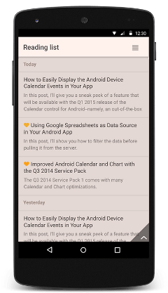
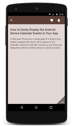
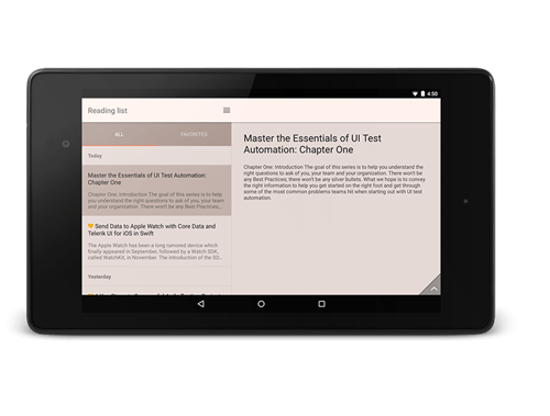
The simplest example is the master-details scenario. On a smartphone, displaying the details would involve navigating to a new screen whereas on a tablet this might not be necessary.
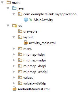
Each of the three major mobile platforms (Android, iOS and Windows) offers its own way of dealing with device fragmentation and loading resource files (layout, images etc.). Android allows you to put different versions of your UI into separate folders.
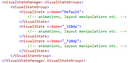
Windows, on the other hand provides an improved ViewStateManager that enables developers in XAML to define different visual state groups for each supported screen size. Using animations inside the group you can modify the UI any way you like it - from toggling the visibility of controls to change individual properties.
In iOS you can build adaptive layouts with universal storyboards, size classes, layout customization and the “ultra-useful Preview Assistant Editor”.
In this post you will show you the approach we've employed in NativeScript when dealing with resource loading but before we proceed I’d like to cover some key terminology.
Screen size - The amount of physical space for displaying your application.
Density - The number of pixels in any given area on the screen. The typical unit of measure is dots per inch (dpi).
Density-independent pixels (dp) - This is a virtual unit of measure to allow layouts to be designed independent of density. There’s a neat formula for converting dp into screen pixels:
px = dp * (dpi / 160)
Orientation - The screen’s orientation is considered to be landscape when it is wider than it is tall. In contrast, portrait orientation is when the screen is taller than it is wide. The orientation can change during the lifetime of an application as the user rotates the device.
Resource files - anything from layout files (.xml) to style sheets (.css) and images.
How to support multiple screen sizes in your NativeScript app?
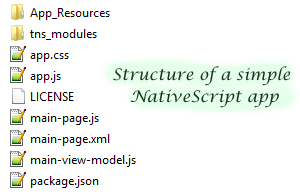
NativeScript, similar to Android, has adopted the notion of file name qualifiers when loading resources.
[file-name].[qualifier].[file-extension]
NativeScript supports three types of qualifiers that enable resource loading based on the screen size, the mobile platform and device orientation.
Screen Size Qualifiers
The screen size qualifiers enable you to use density independent pixels (dp) to instruct the system which resource file to load based on the size of the screen. A typical scenario where screen size qualifiers come in handy is when you want to distinguish between the most popular device screens.
- 320dp - a typical phone screen (240x320 ldpi, 320x480 mdpi, 480x800 hdpi, etc).
- 480dp - a tweener tablet like Samsung Note.
- 600dp - a 7” tablet (600x1024 mdpi) - Barnes & Noble Nook
- 720dp - a 10” tablet (720x1280 mdpi, 800x1280 mdpi, etc) - Motorola Xoom
With that knowledge in mind, you can create a separate resource file for each of the above sizes.
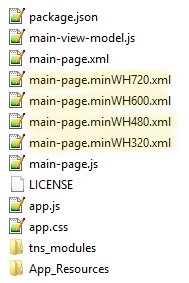
minWH[dp value]
The minW[dp value]
Platform Qualifiers
The platform qualifiers allow you to load separate resource files based on the hosting platform - Android, iOS or Windows*. A typical scenario for platform qualifiers is when you want to make your app comply to the native platform’s style guidelines by providing separate style sheets.
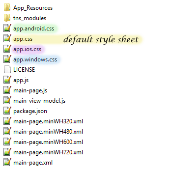
* support for Windows is coming soon!
Orientation Qualifiers
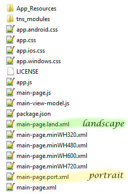
The orientation qualifiers enable you to take the device’s orientation into account when loading resource files. Use land for landscape mode and port for portrait orientation.
Now that you know how to make NativeScript load specific resources, I’d like to finish with some tips for when developing applications that support multiple screen sizes.
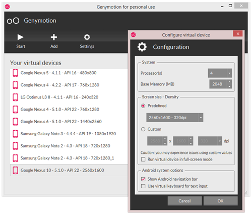
It is always best to test against real devices. If you can’t get your hands on real devices though, make sure you use emulators such as Genymotion[1]. Also, don’t fear to play with the screen size and density options of the virtual device.
Design and develop for only what you need. But still, make an effort to cover the most popular devices and screen sizes from the target platform.
Use density-independent pixels and the conversion formula: px = dp * (dpi / 160)
Thanks for reading and if you have any questions or comments, don't hesitate to share them on the NativeScript forums or in the comments below.
[1] Genymotion is an Android emulator which comprises a complete set of sensors and features in order to interact with a virtual Android environment. With Genymotion, you can test your Android applications on a wide range of virtual devices for development, test and demonstration purposes.
